09 / GRAPHICS / VISUAL DESIGN
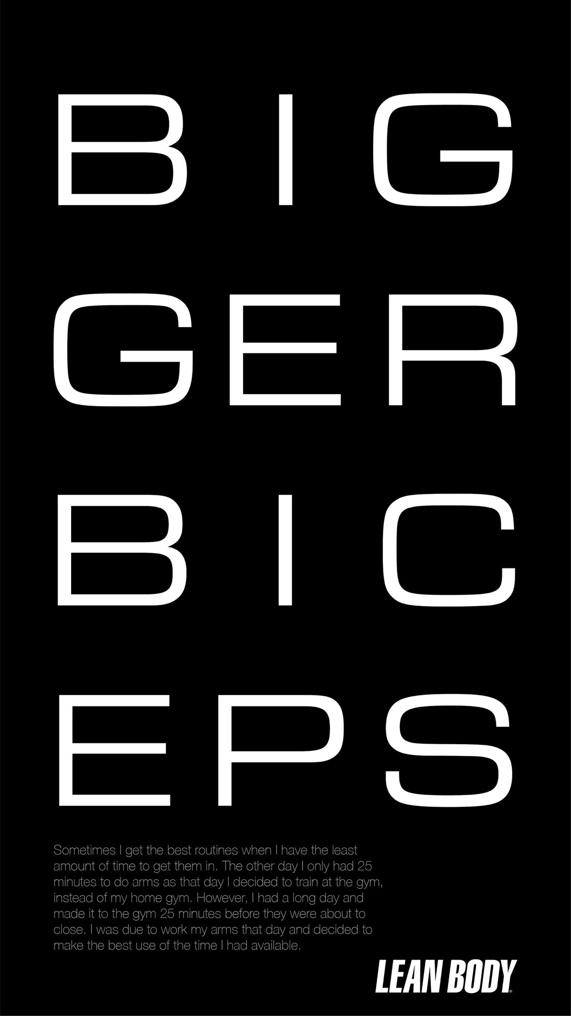
Bigger Biceps Poster
I stripped this poster back to typography. Breaking the words across a narrow vertical grid creates rhythm and asks the eye to move through the composition. Generous spacing and strong black-and-white contrast give the letterforms room to do the work.