12 / Packaging Design
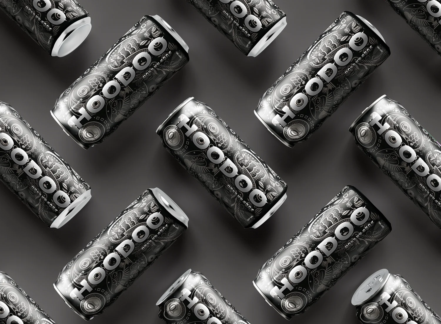
Hoodoo Can
I designed the can to make Hoodoo recognizable at a glance, using bold typography and visual rhythm to build a cohesive package identity.
About This Work
I use bold lettering to give the eye a clear place to land within the detailed black-and-white pattern. The repeated cans and alternating angles create rhythm, while the open gray spaces balance the busy artwork. Strong value contrast keeps the Hoodoo name in focus.