11 / Packaging Design
Faraday Candy Bar
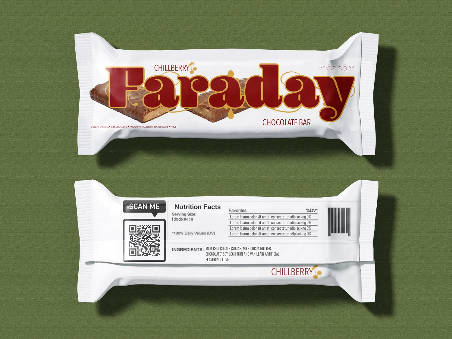
I designed the wrapper to give Faraday a distinctive shelf presence, balancing typography, color and hierarchy in a compact format.
About This Work
I let the oversized Faraday lettering do the talking. Deep red and gold give the fictional brand a rich, familiar feel, while the white wrapper creates contrast and breathing room. On the back, alignment and hierarchy keep the supporting information organized.